
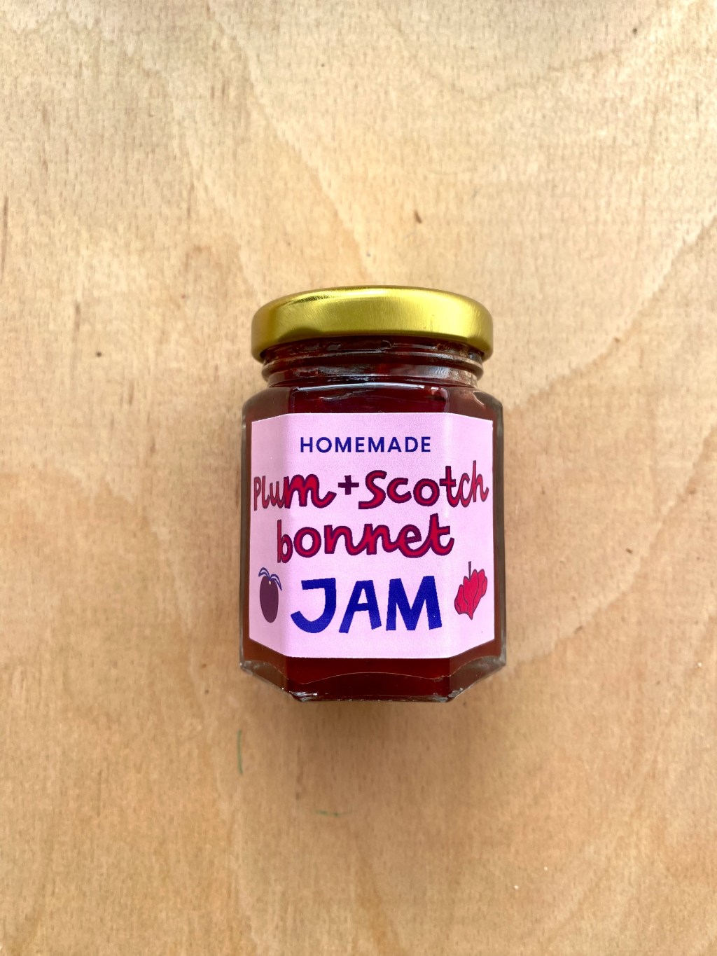
I’m not sure we can declare it a tradition just yet as it’s only our second year doing it, but as of last year, we’ve been making jam from the plums that grow in a family friend’s garden. They’re cherry plums (we think) and as far as we know they started fruiting last August. I think it’s now been assigned our job as we were told this year ‘you need to come back to pick the plums!’ when they started to grow. 😄
We decided to make a spicy chutney with them this year using scotch bonnets, my partner’s chilli of choice, as we already made a plain jam with them last year. The jam lords had other ideas though as the texture very much resembled jam again, which I’m more than okay with. (How many times can I say the word jam in this post?) Making a yearly ceremonial plum jam is just fine by me, and this way we can experiment with making different types of jam each year.
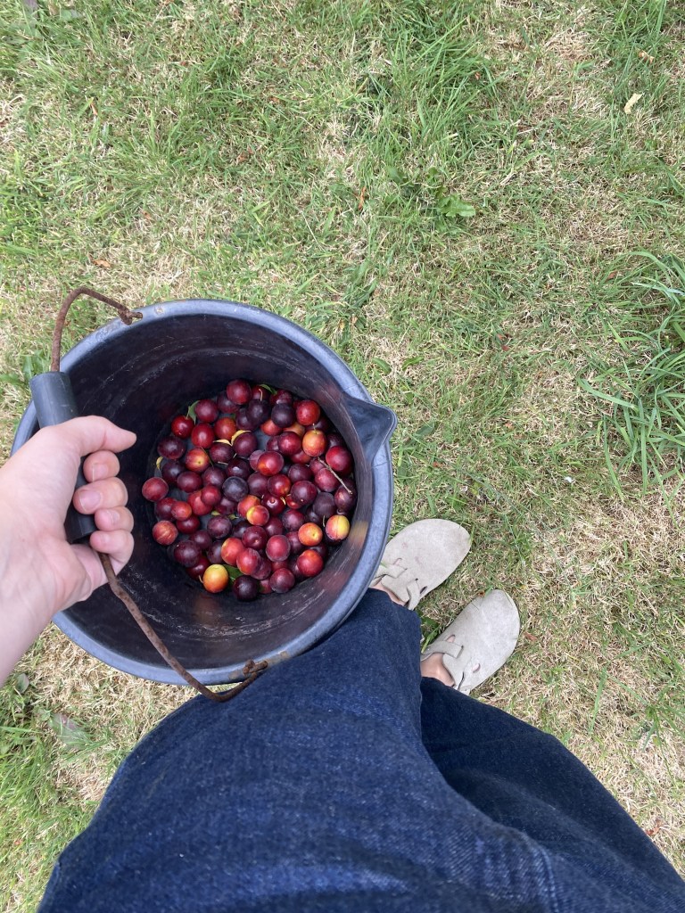
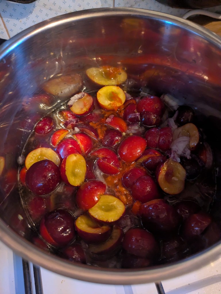
It was so easy to make and just a case of pitting the plums, chopping the chillies and onion, and leaving everything to bubble away and do it’s thing for a while. We saved and cleaned the plum stones to sow in pots later in October, so that maybe in 5 years time we’ll have a cherry plum tree of our own to make jam from. We love circular economy in this household ♽
Then came the best part – designing and printing labels!
We had tried to think of a punny name but nothing quite came to mind that didn’t sound a bit rude, so we just kept it simple, Plum and Scotch Bonnet Jam. I have a work in progress name of ‘this is my jam’ or ‘that’s my jam’ or something along those lines. Maybe the idea will be fully formed in time for next year’s jam? Stay tuned to find out.
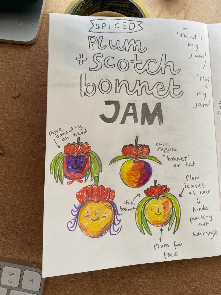
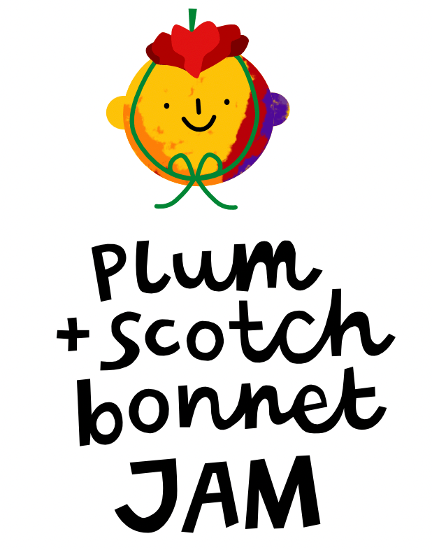
For the label, I had this idea for a plum-faced character wearing a literal scotch ‘bonnet’ on its head, I thought that could be a fun way to visually combine both of the main ingredients. I’ve benched the idea for now though as I think it still needs some workshopping but I did enjoy some of the initial rough sketches:
Instead I hand-lettered the name and drew some simple outline drawings of a plum and scotch bonnet, I think I just drew them with the pen tool on Affinity – which I’ve been trialling recently instead of Adobe Illustrator. So far so good, but I do miss some of the more intuitive features of Illustrator – but you get what you pay for I guess. (Affinity is free, for now…)
We decided to make more small jars rather than larger fewer jars, so that we could share it with more people. As the labels would then need to be quite small, I wanted the main feature to be the bold text with the drawings just for added details. I actually outlined the text by accident when trying to change the fill colour and it ended up being exactly what I needed, I had felt like something was missing and adding the contrasting stroke really made the text stand out!
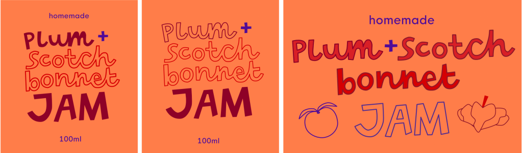
For the colours, I planned to use the peachy oranges, yellows, reds and purples that the plums were coloured with and the deep red of the chillies. These colours complemented each other nicely and I found myself with a vibrant draft colour scheme which worked pretty nicely and kind of said ‘watch out, I’m a lil spicy!’:
But then I realised, I use these colours literally all the time! I don’t know how it happens but so often in self-initiated creative projects I find myself unconsciously coming back to these same colours. It’s like my internal colour compass gravitates back to them… maybe it’s fate? On this occasion though, I disregarded fate’s wishes and actively made myself use different colours. I still think the original colours work well, I just wanted to mix things up this time.
The short-listed colour options were then:
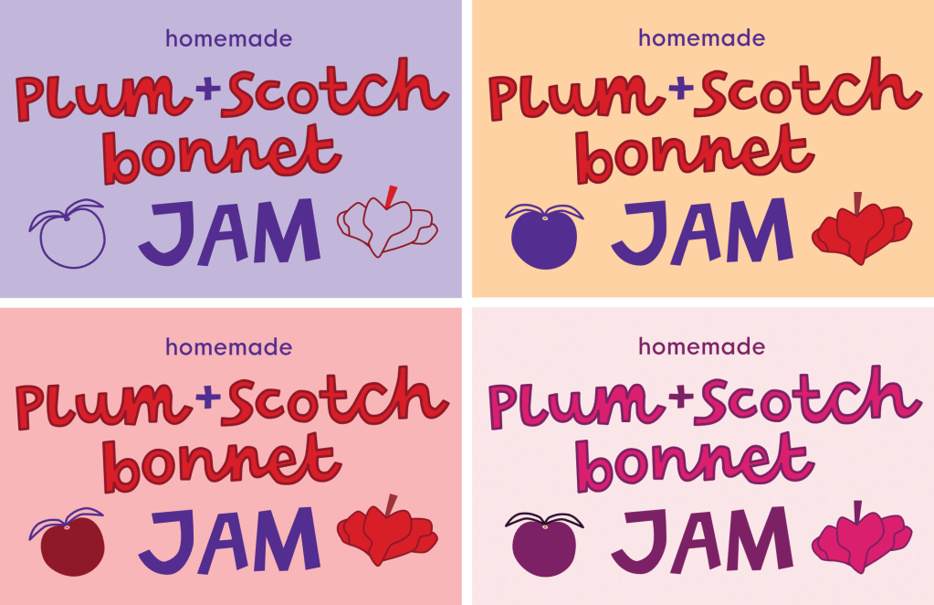
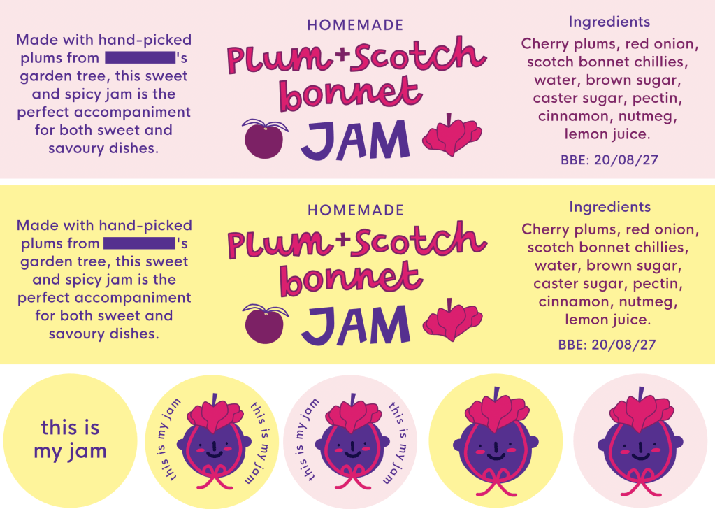
I could’ve happily chosen any of these as the final palette, I thought the contrast was pretty good on all of them and worked with the fruit inspired colour scheme! Ultimately though, I chose to mix and match the pink and the yellow options as I thought they worked well together and felt bright and summery. I ended up tweaking the yellow background to make it more vibrant and then I moved on to final production in the makeshift jam factory aka my bedroom/office/studio.
Names blanked for privacy purposes
I tried both a full wraparound design and separate back and front labels. I thought the separate labels would work better as the jars we used were pretty small and I wanted the contents of the jam to still be seen alongside the labels, as the colour of the jam was so deep and rich. If we used bigger jars next time though, I’d love to do a full wraparound with the extra written details on to make it feel more special and tell the story of where the ingredients have come from.
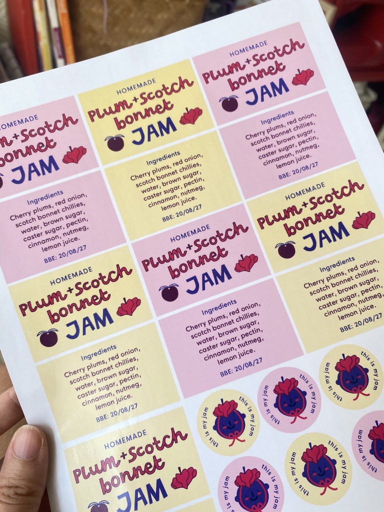
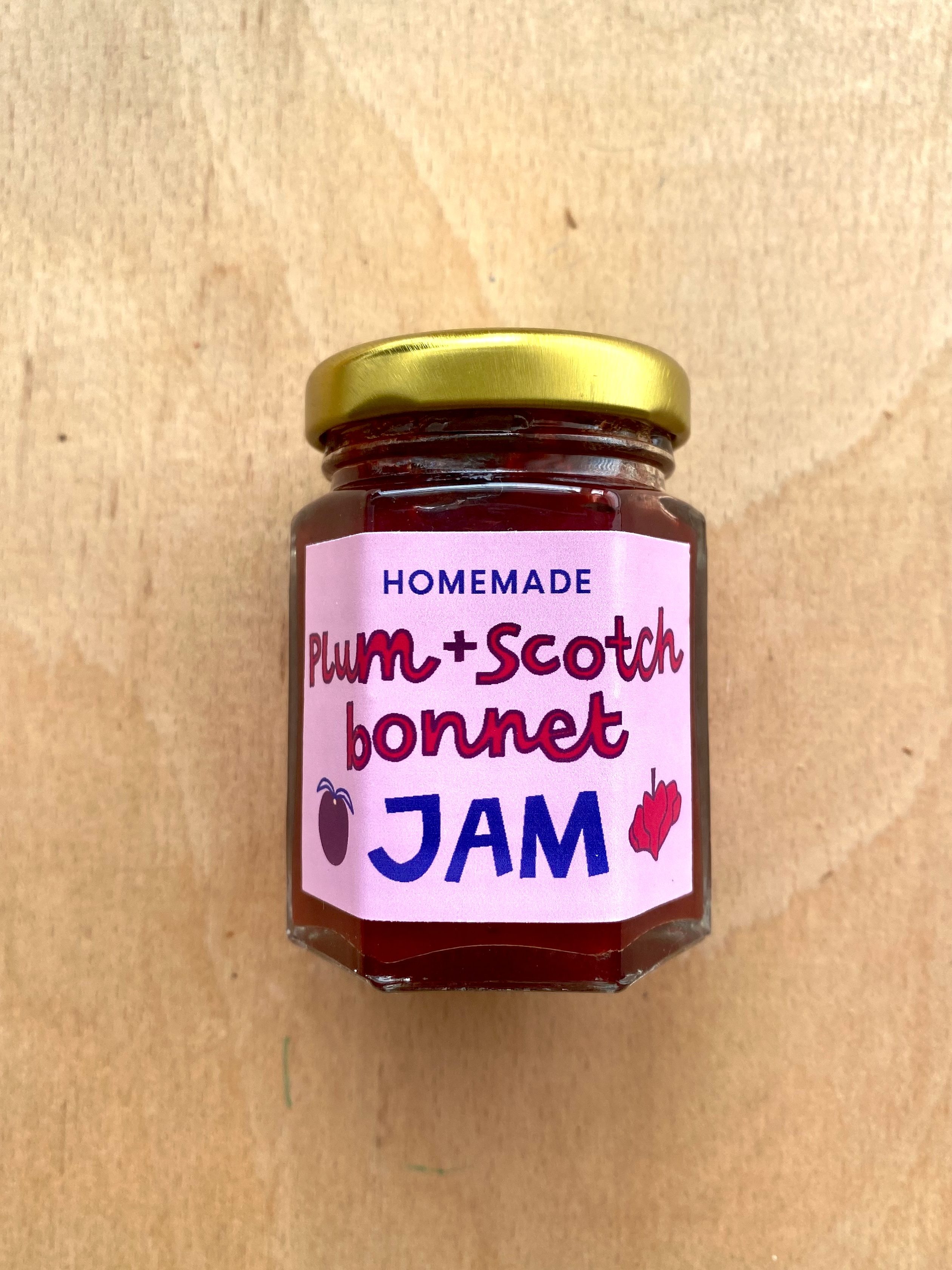
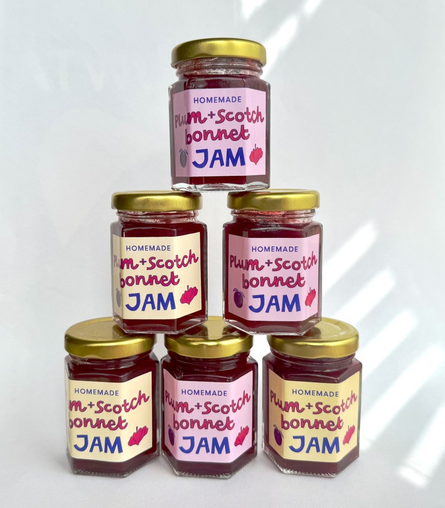
After getting all the sizing right, I printed the labels out on glossy self-adhesive paper and trimmed the labels to size before sticking them on the jars. This part was so exciting and satisfying, it really made our homemade jam feel like a proper product!
As an added extra, I decided to take some more ‘professional’ looking photos of the jars with a clean backdrop. I mean, who doesn’t love using the classic trick of a white sheet of paper and sunny window to make their own mini photography studio? It delivers every time.
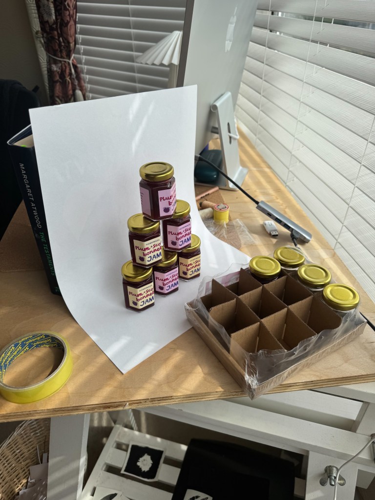
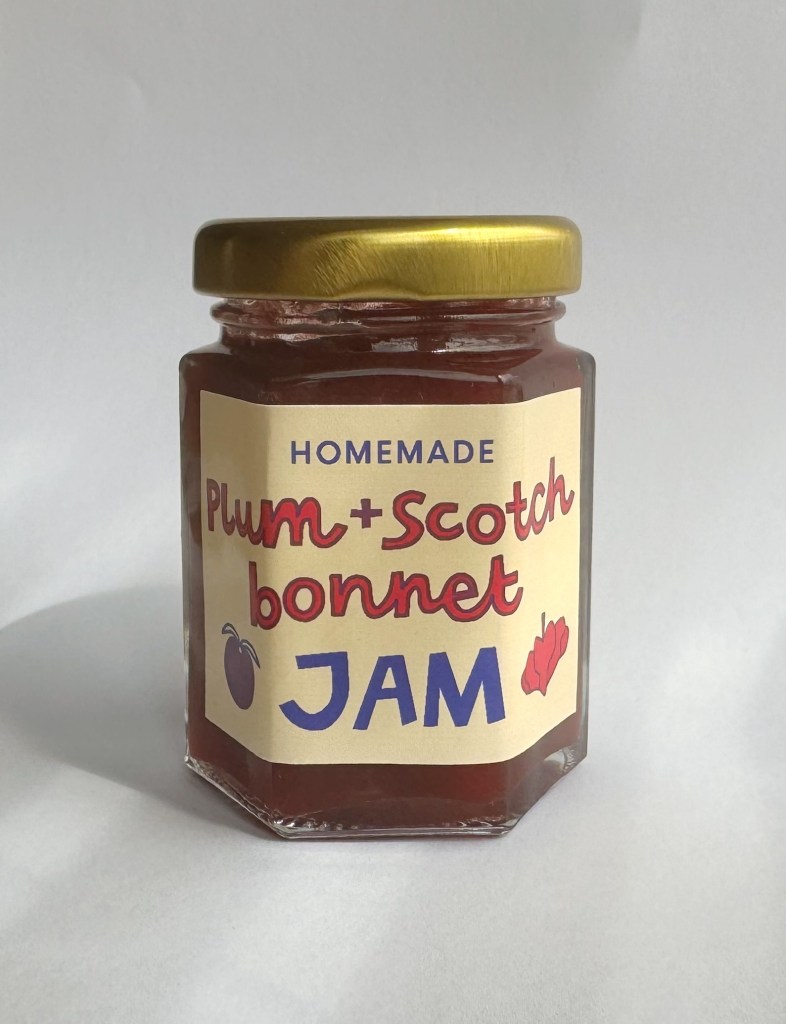
And there we have it, a homemade jam and a snazzy label to match! Now we just need to taste test it out with a cheeseboard in the garden, and start brainstorming ideas for next year’s jam…
 catdidthis
Leave a comment